How to write good alt text: a practical field guide
Good alt text isn't about vocabulary — it's about judgment. Here's how to describe any image well, with examples, length rules, and the one question that drives every good description.
Most advice about alt text stops at “describe the image.” That’s true, and it’s almost useless. Two people can describe the same photo and produce two completely different lines — one that helps, one that wastes everyone’s time.
The difference isn’t vocabulary. It’s judgment. Good alt text comes from asking the right question before you write a single word.
The one question that drives everything
Before you describe anything, ask: what is this image doing here?
Not “what’s in it” — what is it for. The same photograph needs different alt text depending on where it lives:
- On an e-commerce page, a photo of a watch is the product. People need to know the dial color, the strap, the size on the wrist.
- In a news article about a factory closing, that same watch on a worker’s wrist is about the person — the alt text should carry the human moment, not the model number.
- In a design portfolio, it might be about the lighting and composition.
Same pixels. Three different jobs. If you describe the image in isolation, you’ll get it wrong more often than right. (This is also why automated tools can only get you so far — they see the image, but you know why it’s on the page. More on that below.)
What good alt text actually looks like
Good alt text is specific, functional, and written for the context. A few principles that hold up everywhere:
- Be specific. “Golden retriever catching a frisbee mid-air in a park” does real work. “Dog outside” does not.
- Don’t say “image of” or “photo of.” Screen readers already announce that it’s an image. You’re repeating information the listener just heard.
- Lead with what matters. Screen reader users can’t skim — they hear it start to finish. Put the point first.
- Match the surrounding content. Alt text isn’t a caption for the world; it’s a description for this page.
Good vs. bad, side by side
Abstract rules get slippery, so here it is concretely. Same images, two versions each:
| Context | ❌ Weak | ✅ Better |
|---|---|---|
| Recipe blog hero | alt="food" | alt="A bowl of ramen with a soft-boiled egg, sliced pork, and scallions in a dark broth." |
| Product page | alt="IMG_4827.jpg" | alt="Navy canvas backpack with brown leather straps, shown from the front with side water-bottle pocket visible." |
| News article | alt="protest" | alt="A crowd of several hundred people filling a city street at dusk, many holding handmade signs." |
| Charity landing page | alt="happy child smiling" | alt="A child drinking clean water from a new village well, with others waiting in line behind." |
Notice the better versions aren’t longer for the sake of it. They’re longer because they carry the information the page actually depends on.
How long should alt text be?
Aim for roughly a sentence — under ~125 characters when you can. That’s not a hard legal limit; it’s about how people listen. Many screen readers handle long alt text fine, but a description that runs for three sentences becomes a chore to hear, especially when there are several images on a page.
If an image genuinely needs more — a chart, a complex diagram — that’s a signal to use a short alt text plus a longer description elsewhere on the page (see below), not to cram everything into the alt attribute.
The cases people get wrong
Decorative images get empty alt text. If an image is purely visual — a divider, a background texture, a flourish that adds nothing to the meaning — use alt="". That tells screen readers to skip it entirely. Leaving the attribute off completely is not the same thing; some screen readers will then read the file name out loud, which is worse than silence.
Functional images describe the action, not the picture. If an image is a link or a button — a magnifying-glass icon that runs a search, a logo that links home — describe what it does, not what it looks like. alt="Search" beats alt="magnifying glass icon". The user cares where the button goes, not its shape.
Images with text in them include the text. If the image is a quote card, a sign, an infographic headline, or a screenshot with words that matter — put those words in the alt text. They’re invisible to screen readers otherwise.
Complex images get a short alt plus a long description. A chart’s alt might be alt="Bar chart: alt-text adoption by CMS, described below." and then the actual data lives in real text near the image — a caption, a paragraph, or a data table. Don’t try to narrate an entire graph inside one attribute.
Common mistakes worth naming
- Keyword stuffing. Cramming search terms into alt text doesn’t help SEO and actively harms the people the field exists for. Describe the image honestly; that’s also what search engines reward now.
- Dumping the file name.
alt="DSC_0041"is the absence of alt text wearing a costume. - Repeating the caption. If the visible caption already says it, the alt text shouldn’t echo it word for word — that’s the same sentence read twice.
- Being vague to be safe. “Image” or “photo” or “graphic” passes an automated checker and fails every actual human.
Why the blank field keeps winning
None of this is hard. So why is so much of the web missing alt text, or filled with placeholders?
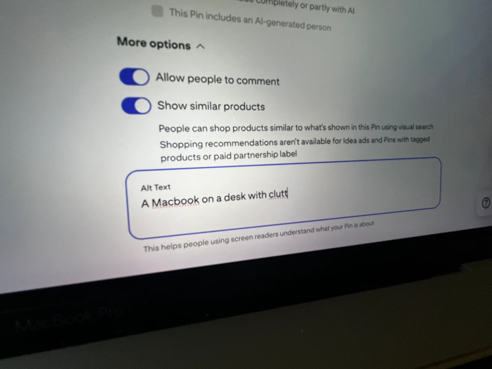
Because the workflow doesn’t make it easy to care. You’re publishing fast. The field is buried under a “more options” menu. The images were uploaded by someone else months ago. Writing the description takes a moment, and that moment is the first thing to get dropped when you’re moving.
This is the real problem — not knowledge, friction. (We wrote more about why that second keeps getting skipped here.)
Where tools fit
There are browser extensions now — Panopt is ours — that let you right-click any image on any page and get an accurate, considered description back in a couple of seconds. You review it, adjust for context, and drop it where it goes.
That doesn’t replace the judgment in this guide. The tool can see the image; it can’t always know why the image is on your page, or which of the three watch descriptions above is the right one. What it does is kill the blank-field excuse. The hardest part of alt text was never the writing — it was starting. When a solid first draft is one right-click away, “I’ll add it later” stops being a reason.
The checklist
Before you publish, run the image through this:
- What’s this image for on this page? Describe its job, not just its contents.
- Is it specific? Could someone picture it from your words alone?
- Did I drop “image of / photo of”?
- Is it decorative? If so,
alt="". - Is it a link or button? Describe the action.
- Does it contain text that matters? Include it.
- Is it short enough to listen to? Roughly a sentence.
Good alt text isn’t a writing skill so much as a habit of stopping for one second to ask what the image is doing. The tools can hand you a draft. The judgment is still yours.
New to this? Start with what alt text is and why it matters. Run a Pinterest account? Here’s what alt text does for your pins.